All three of our products follow the conventions of real media products, we wanted to make sure we did this so this is why we first researched existing products of which are detailed below
Video
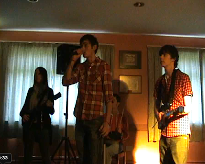
We used a mixture of narrative and band performance in our video as this is both what the videos we researched involved, but also what we wanted to use. Some videos showed good times, whilst others showed footage about relationships. We were able to get both of these intertwined into each other in our video because of the downfall of the relationship between the couple and the eventual death which leaves the female thinking back to good times in her mind. Another convention we found from our research, but also just from seeing videos aired on the TV or internet, was that the band is often shown performing and so we also included this in our own product.

Digipack
We also stuck to the conventions of existing media products in this area as we didn't want to create anything too different that may put people off. The key was to keep it quite simple and not have too much on it as this would have spoilt the effect of the cover and probably make people not want to pick it up unless they knew the band well. We achieved this well because the only thing on our cover was the image of the band which was pretty simple and didn't have much going on in the background. We also knew that colours should have been limited as too many bright ones would have spoilt it, so we chose to keep to a black and white scale as this tied in with the video and the depressed state of the female character. Another convention we followed was the use of band members on the front which also allows people to identify the album as the band's more easily if they recognise the band members, and if they don't recognise the band members, seeing the name above them will help to associate the two in the future. The text we used was kept ro a minimum as this is a convention we found and we also made sure it stood out well on the background we had used.
Our product

Magazine Advert
We also stuck to the conventions here. The main focus was the image of the band as I found this was quite common from my research. Another thing we had to make clear was who the album was by and the name of the album, of which we did by printing these in a large font and in a colour that would stand out on the background used. We also kept the colour to a minimum by turning the images to black and white and using a similar style for the text involved. As for other information which was and wasn't included in my research, we chose to include the release date, 'Out Now' in our case, but to leave out things such as the website. We did this to keep it as simple as we could and not have too much text on it which could ruin the overall effect of the advert.

Our product

How effective is the combination of your main product and ancillary texts?
I think all of our products were combined well as they each tied into each other. Our main focus was on the video which we planned and thought about first, whilst the other two remained in mind throughout but weren't worked on until nearer the end of the project. All three of our products were based around two main points we used, the first being the graveyard and the second being the band.
I think the package overall is quite successful at promoting the album and synergising because they all look similar and links can easily be made between the three. I feel that the magazine advert could have been slightly more informative to help link to the other two products, such as a website which would display the video. However, I do think it does a good job of advertising the album because it was kept simple and has all the information which was needed.
I also think that we did a good job of meeting the requirements of the target audience we determined in the early stages of the project. First of all we had to create our video to meet these needs as a high proportion of people involved in my initial research did watch music videos either often or regularly. We also incorporated the fact that people liked to see both narrative reflecting the lyrics and random narrative in the video as this was the main storyline, but another part which was highly liked was to see the band members in the video of which we also achieved. We also used a number of locations both to keep with what our target audience liked to see and also to make the narrative flow better.
What have you learned from your audience feedback?
Our audience feedback was better than expected and we had a lot of good comments about the video. As a group, we also felt our products were developed well and would be effective at their aims. In the first week of having the video on YouTube we managed to get over 600 hits and is still rising as people continue to watch it. There were a few mixed comments on the YouTube video, but most of which were positive;
- 'great job :) it's really good'
- 'full on love 4 this! xxx'
- 'awesome =) love the story, and the shock horror at the end!'
- 'Well made video, awesome tune too ;D Nice one.'
Showing people our digipack and magazine advert they also said that they linked well to the video because of the storyline and also that the two ancillary texts looked very similar was a good feature. Another thing people liked was that they were kept relatively simple and not too 'in your face' as one person put it.
How did you use media technologies in the construction & research, planning & evaluation stages?
We used a number of technologies in the creation of our products. The first thing we had to do was to research other products, of which was done first of all by looking at other music videos on the internet. We did this on YouTube as it's the most popular video site and would have had a range of videos to analyse. To research digipacks and magazine adverts, we had to use a more physical form of media product by looking at the actual items in our hands. To conduct my reasearch I sent my questionnaire via email and posted it on facebook to get some responses of which was successful and I ended up putting a limit on how many replies I would use as there was a high number. Another technology I used was blogging to keep track of our progress through the project and so it could all be in one easy to access place without paperwork all over the place. I think this was a very good way of presenting the project and has worked very well!
When it came to actually creating our own products it became slightly more technical. Using the camera and tripod wasn't a very hard task because we'd done this before and were even allowed to practice using these at the end of the AS year. However, filming the band shots were slightly harder because of a not-fully-functional tripod and so this wasn't as effective as it could have been. Next up came the editting and for this we used Adobe Premiere Pro of which seemed to be quite a complex program at first glance. However, once I knew what I was doing on this it all became pretty simple and the editing process got quicker as we moved through the sequences. I think we used this very effectively as the final product flowed well and received a good reception. The final piece of our development phase was using Photoshop to create the digipack and advert to accompany the video which was also a relatively simple task. It became simple because we had all used the software before and understood what features did what and were able to get an effective final product in both areas.


